
Most patch text problems are not design problems. They’re production problems. A font that looks clean in a mockup can stitch up thicker, tighter, and less readable once thread hits fabric, especially when the letters are small.
In this guide, I’ll show you how to pick fonts that stay readable on patches, what letter height and spacing you should aim for, and which font styles usually fail in embroidery. I’ll also share a quick checklist you can use before you approve a run, including a simple way to preview the stitches in our PES file viewer or DST file viewer so you can catch issues early.
By the end, you’ll know how to choose lettering that stitches cleanly for embroidered patches whether you’re making brand patches, team identifiers, or uniform name tags.
Why Font Choice Actually Matters (More Than You Think)
Here’s the thing: embroidery has rules that don’t apply to print. Thin lines vanish. Delicate serifs blur into one another. That elegant script you loved? It might look like cursive chaos once it’s translated into thread on a 2-inch patch.
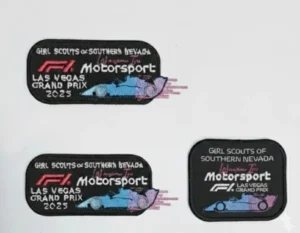
I’ve learned this the hard way. We once had a client order custom patches for events for the Las Vegas Grand Prix. They wanted their full event title on a small 2-inch patch. After 8 hours of work trying to make it readable, the sample just didn’t meet our quality standards—the text was cramped and illegible. We refunded their payment in full. That’s why we always share samples before moving to production; if the design doesn’t work, we adjust or we walk away. Small size and big text simply don’t go together, no matter how you push it.
When you’re working with custom patches, the font isn’t just decoration—it’s communication. A motorcycle club needs something bold and rebellious. A corporate team wants clean professionalism. A festival badge craves playful energy. Your typeface choice sets the entire tone before anyone even reads the words.
The Golden Rules of Patch Typography
Legibility trumps everything. If your text is under a quarter-inch tall, stick with straightforward fonts. Fancy flourishes won’t survive the needle.
Contrast is your best friend. Dark thread on light backgrounds (or vice versa) makes text pop. Low contrast? That’s a one-way ticket to squint city.
Spacing saves lives. Letters crammed together create visual chaos. Give your characters room to breathe, especially on smaller patches.
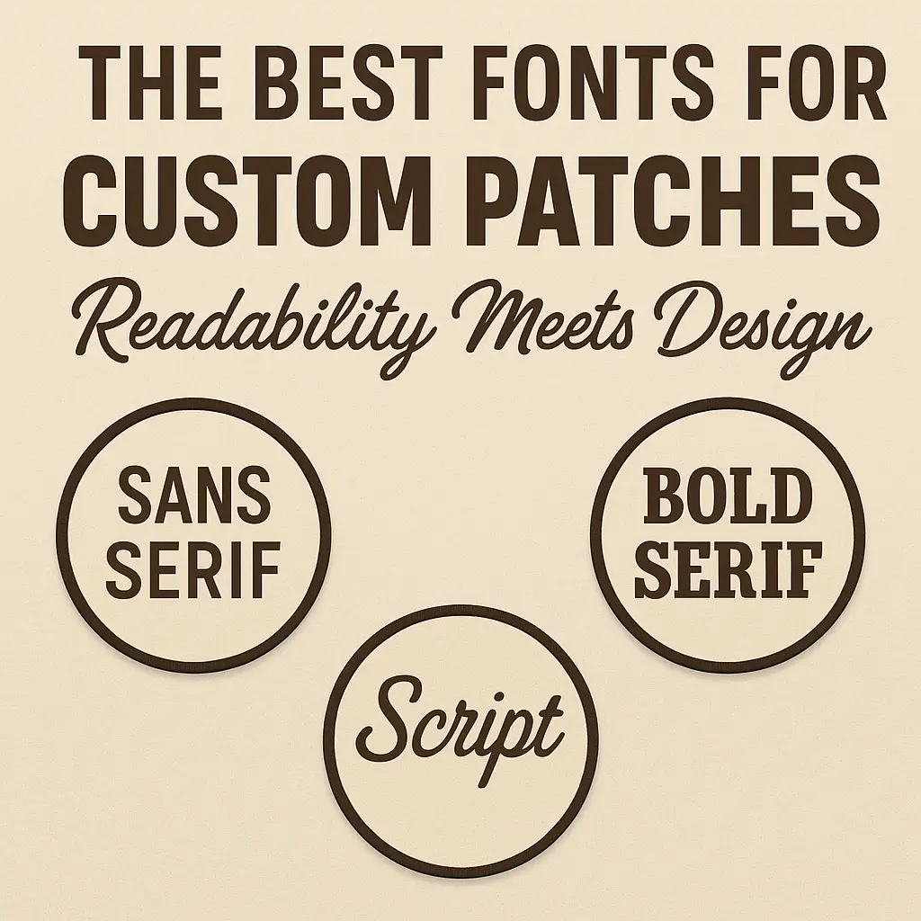
Font Families That Actually Work on Fabric
Let me walk you through the heavy hitters—fonts that translate beautifully from concept to cloth.
Block Sans-Serif (Helvetica, Arial Bold, Futura): These are your workhorses. Clean, modern, endlessly readable. Perfect for name tags, uniform identifiers, or any situation where clarity matters more than flair. I’ve seen these fonts work magic on everything from hoodies to baseball caps.
Military Stencil Fonts: Think bold, angular, no-nonsense. These deliver that tactical edge that works brilliantly for morale patches or anything with a rugged vibe. The chunky letterforms hold up beautifully in thread, even at smaller sizes.
Vintage Serif (Bebas Neue, Rockwell Bold): Want that heritage feel without sacrificing readability? Go bold with your serifs. Thin serifs are embroidery’s enemy, but thick, confident ones add character while staying crisp. Great for brands that want to feel established and trustworthy.
Script Fonts (Use Sparingly!): Here’s where people get into trouble. Delicate scripts look gorgeous on wedding invitations but can become unreadable tangles on patches. If you must use script, go big, bold, and simple. Think less “fancy calligraphy” and more “bold brush strokes.”
The Font Selection Quick Reference
| Font Type | Best Use | Worst Use | Why It Works |
| Sans Serif | Name tags, uniforms | Intricate mini logos | Thick, clean strokes maintain clarity at small sizes |
| Stencil | Tactical & morale patches | Very long sentences | Chunky, blocky forms hold shape consistently in thread |
| Bold Serif | Vintage branding | Small patches (<5mm) | Strong serifs maintain definition without breaking |
| Script | Large fashion patches | Text sizes <6–10mm | Delicate curves merge when stitched too small |
According to Wilcom’s official lettering guidelines, most embroidery fonts need a minimum height of 4–5mm to remain legible. Ricoma also recommends at least 5mm for clean block text and warns that scripts require even more height—sometimes 10mm or larger to prevent the curves from bleeding together. These guidelines align with recommendations from both Wilcom’s Embroidery Lettering Essentials and Ricoma’s Small Letter Embroidery training materials.
Minimum Letter Height: The Most Important Rule
Here’s where theory meets reality. Ignoring these minimums is the fastest way to waste money on unreadable patches:
- Sans-serif fonts: 4–5mm minimum (Wilcom standard)
- Block/Stencil fonts: 5mm minimum (Ricoma recommendation)
- Script fonts: 8–10mm or larger—no exceptions
Real-world examples: Helvetica Bold at 12pt on a 2-inch patch? Works beautifully. Bodoni at the same size? Complete disaster—those thin serifs disappear the moment thread hits fabric. This is why we always test samples before committing to full production runs.
Now let’s talk about how all these technical details play out in actual patch design.
Matching Fonts to Patch Purpose
Different applications demand different approaches. A chenille letter jacket patch can handle thicker, more textured fonts because of the chunky yarn. Meanwhile, detailed embroidered patches for jackets need cleaner typefaces that won’t get lost in the detail.
For iron-on applications, consider how the backing affects text appearance. Heat-sealed patches often have slightly softer edges, so you’ll want fonts with a bit more weight to compensate.
Understanding these material differences helps you make smarter design choices from the start.
Soft or stretchy fabrics like fleece or jersey distort small text more easily than stable fabrics like twill, canvas, or felt because their movement and texture interfere with stitch precision.”
Size, Spacing, and Stitch Density
Here’s where technical meets aesthetic. Letters under 5mm tall? Forget intricate fonts entirely. Stick with bold, simple shapes. For larger patches (think 3 inches and up), you’ve got more creative freedom, but don’t go wild—remember that every curve and corner needs to be translated into thread paths.
Stitch density matters too. Over-digitized text creates stiff, board-like patches. Under-digitized text falls apart. Polyester thread holds crisp detail better than rayon at small sizes because it has higher tensile strength and resists fraying, making it ideal for tight lettering. A quality patch maker understands this balance instinctively, adjusting thread density based on font weight and size.
The Color Connection
Font and color work as a team. High contrast combinations (black on white, gold on navy, white on red) make text sing. But here’s a pro move: outline your letters with a thin contrasting border. It adds definition and makes text legible even on busy backgrounds.
These color principles become even more critical when you’re working with complex designs or limited space.
Where Typography Goes Wrong (And How to Avoid It)
I’ve seen designers fall in love with elaborate fonts that simply won’t work once stitched. The most common mistake? Choosing style over substance. That ornate Victorian typeface might fit your brand aesthetic, but if nobody can read your company name on a 2-inch patch, what’s the point?
Another trap: matching your website fonts exactly. Digital fonts and embroidery fonts are different animals. What works on screen might need adaptation for thread. Work with experienced makers who understand this translation process.
Common Mistakes Designers Make With Patch Fonts
- Using ultra-thin fonts that collapse during stitching.
- Choosing on-screen fonts that don’t translate well to fabric.
- Ignoring how fabric type and backing affect text clarity.
Making Smart Typography Decisions
Start by asking yourself: What’s the primary function of this patch? If it’s identification (name tags, team uniforms), prioritize crystal-clear readability. If it’s branding or style expression, you’ve got more creative latitude—but clarity should still win most tie-breakers.
Consider your audience too. Patches for kids’ clubs? Go playful but legible. Corporate merchandise? Keep it professional and refined. Festival gear? You can push boundaries while still keeping text decipherable.
The Final Word on Patch Fonts
Great typography on patches isn’t about following trends or picking the prettiest font—it’s about understanding the medium’s limitations and working within them creatively. The best patch fonts balance personality with practicality, making statements that are both bold and readable.
Whether you’re designing custom embroidered pieces for your small business or creating memorable team identifiers, remember this: fonts are more than letters. They’re the voice of your patch, speaking volumes before anyone reads a single word.
Choose wisely, test thoroughly, and never sacrifice readability for style. Your patch’s message depends on it.
About the Author: With 5 years of hands-on experience in custom embroidery and patch production, our team at Teddy Patches has worked with everyone from small businesses to major event organizers. We’ve learned what works (and what doesn’t) through real client projects, countless sample iterations, and a commitment to quality over quick profits. Our experience includes everything from corporate branding to large-scale event patches, always prioritizing readability and durability in every stitch.